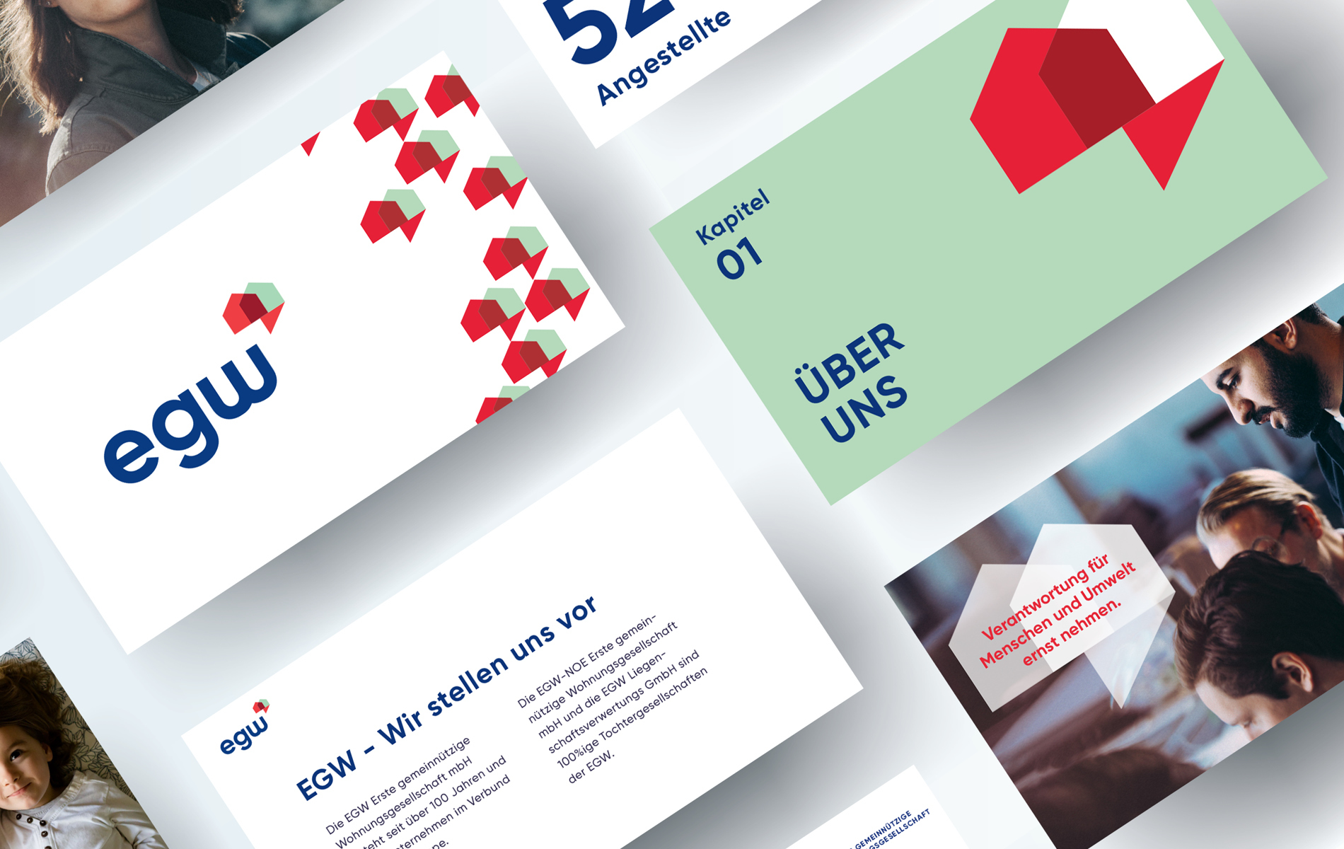
EGW
BRANDING // DIGITAL // PRINT // PROMOTIONAL
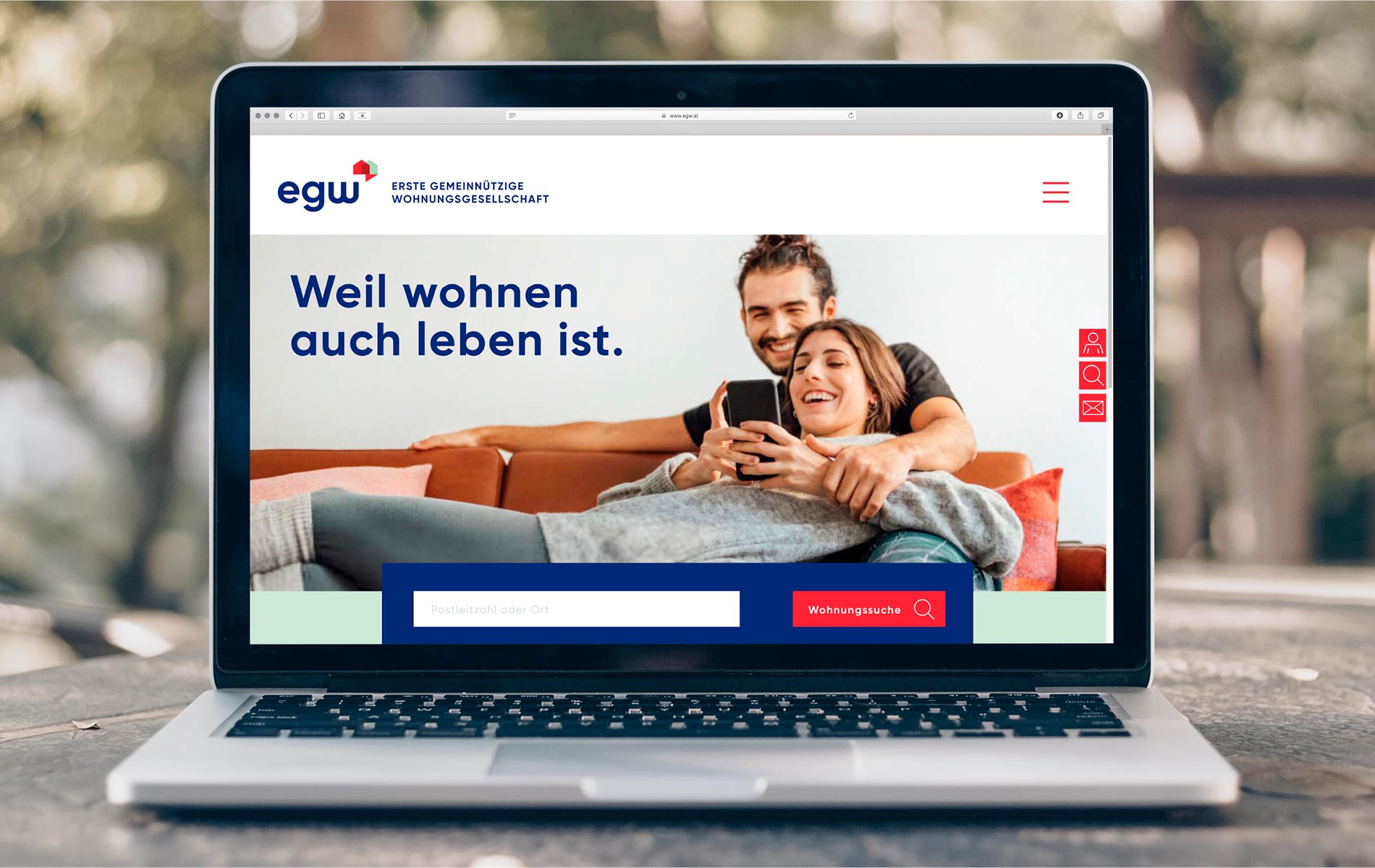
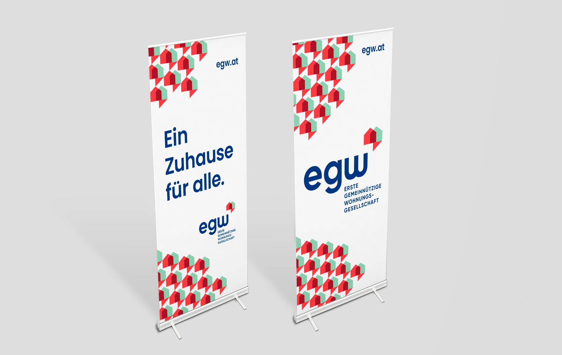
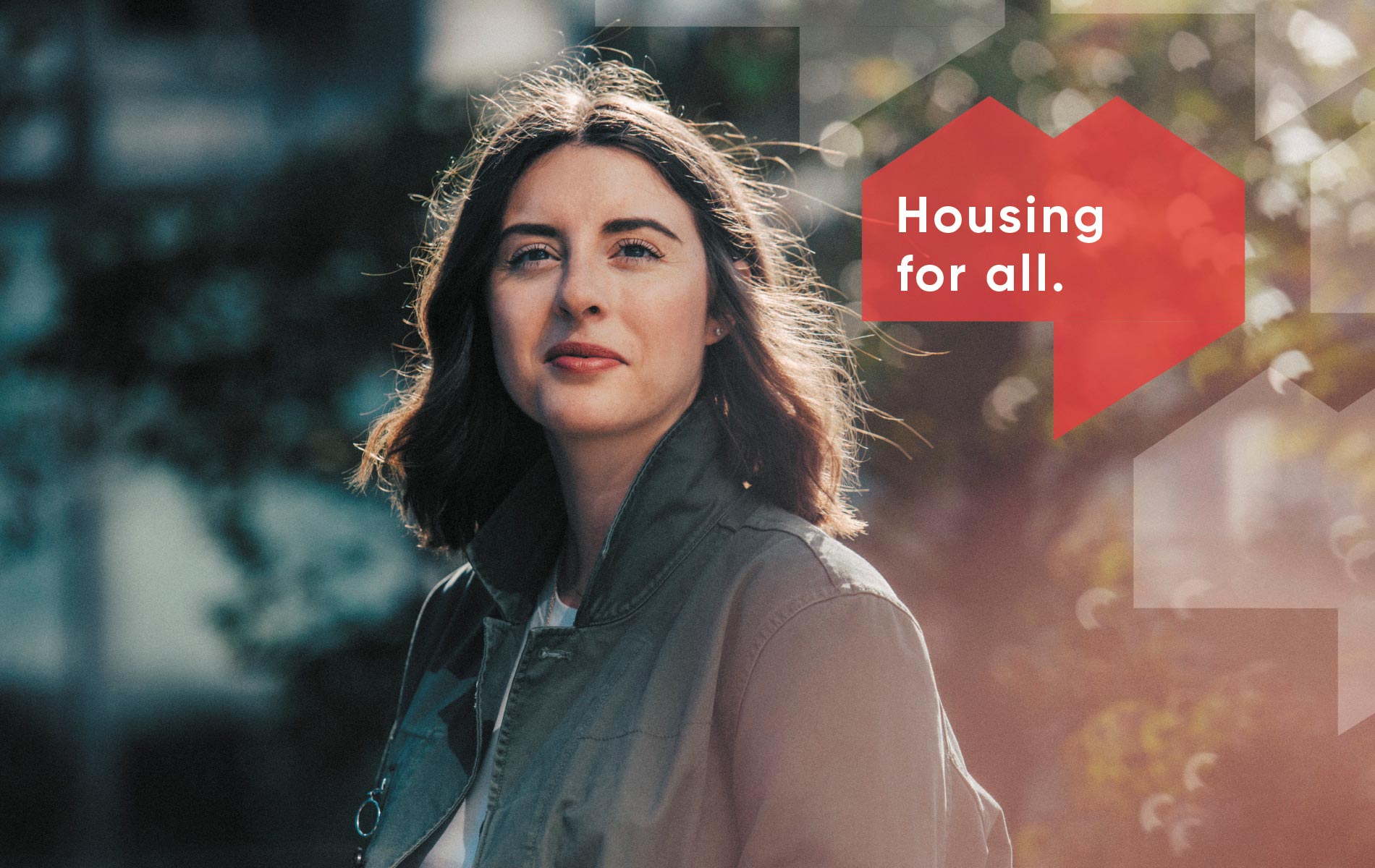
EGW is a non-profit housing company that strives to create living space for all needs and situations, in high quality and at affordable prices.
Our brief was to create a new identity to refresh the image of this 100 year old company, redefine its values and make a design language that stands firm for decades to come.
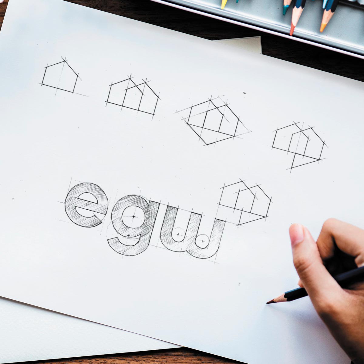
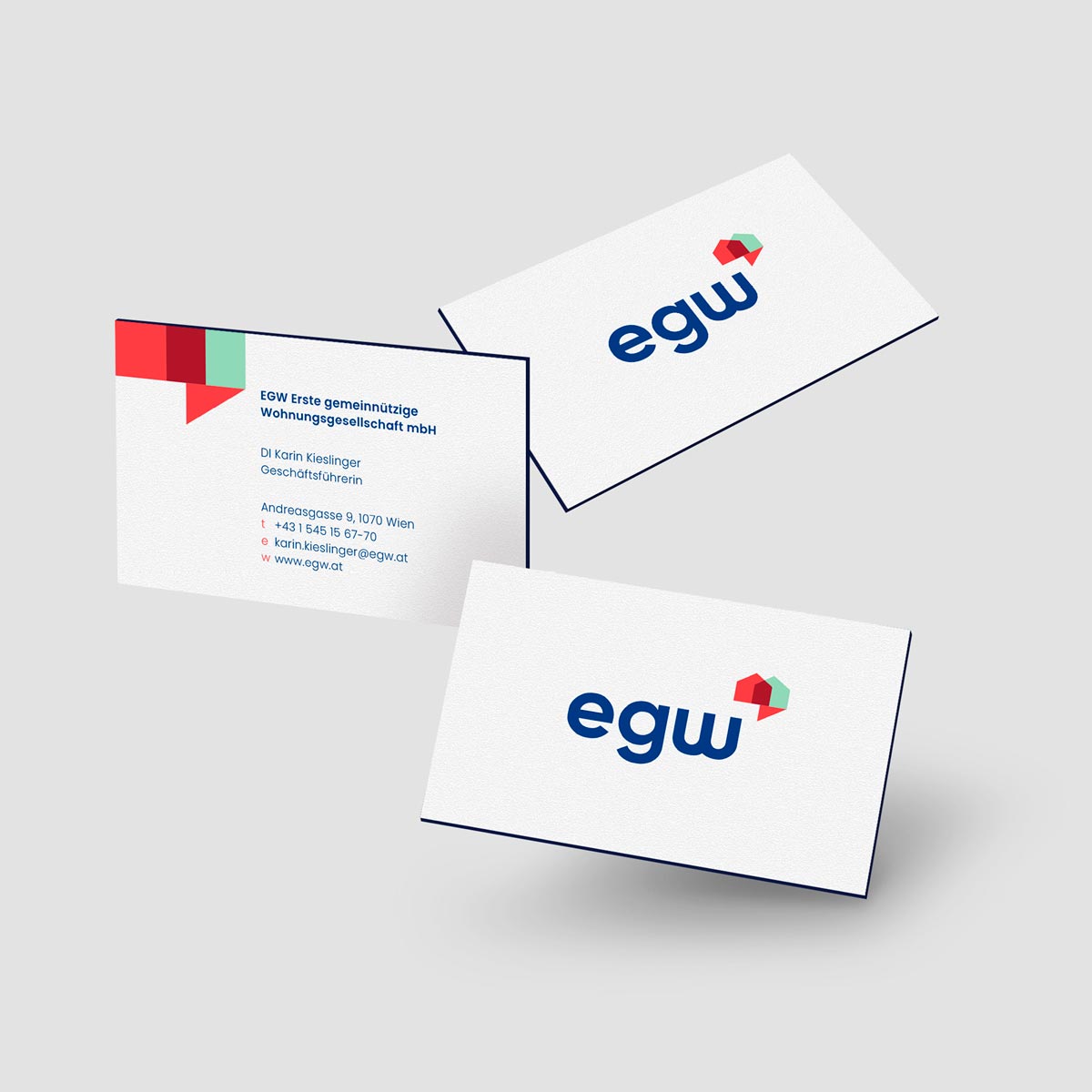
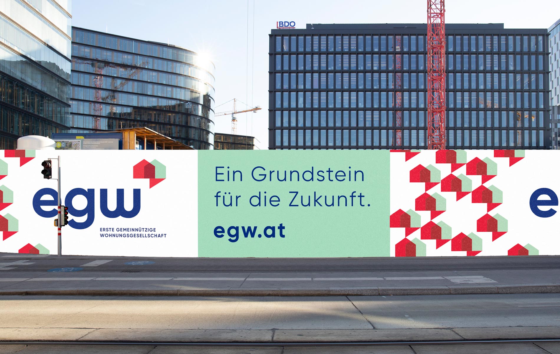
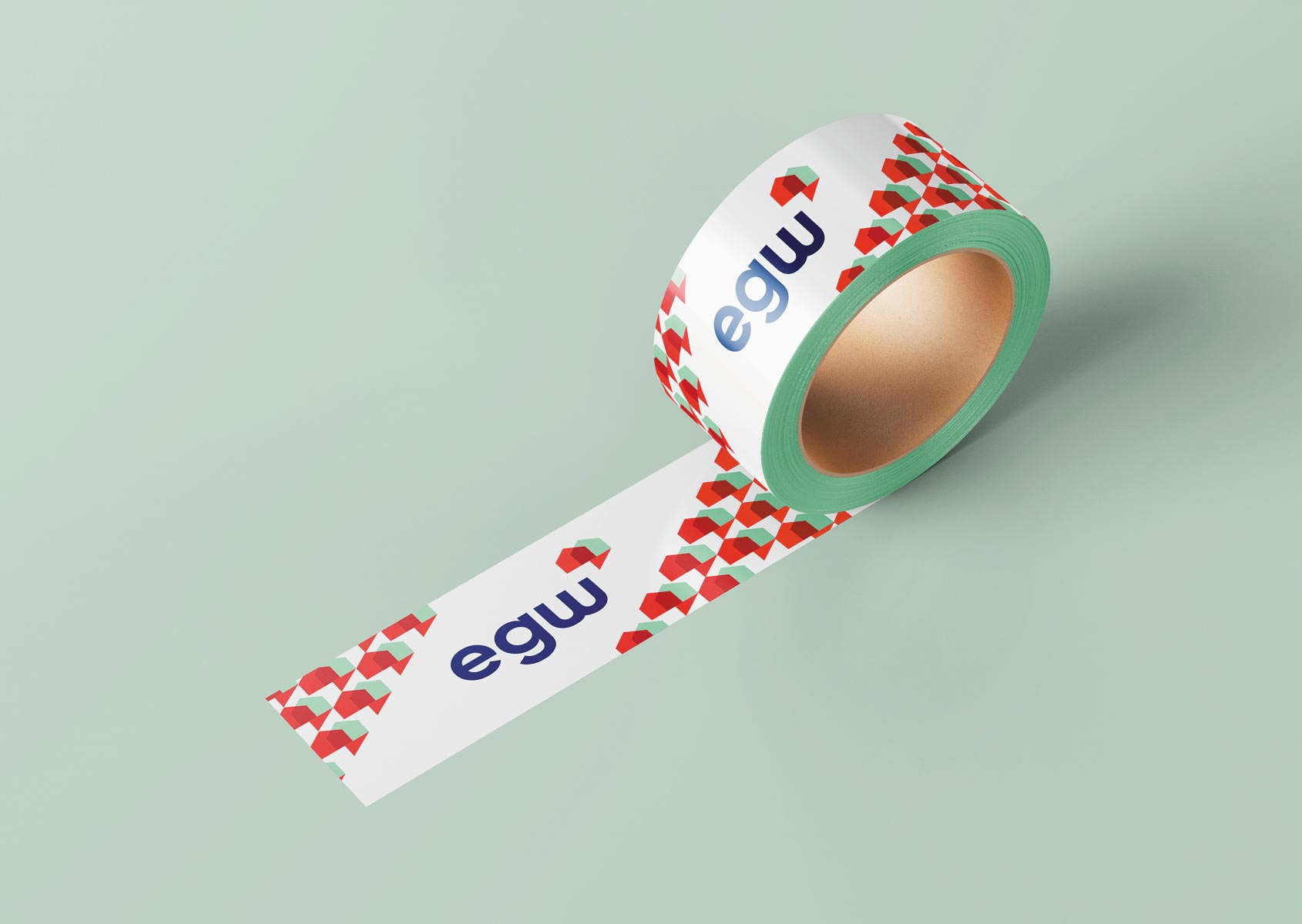
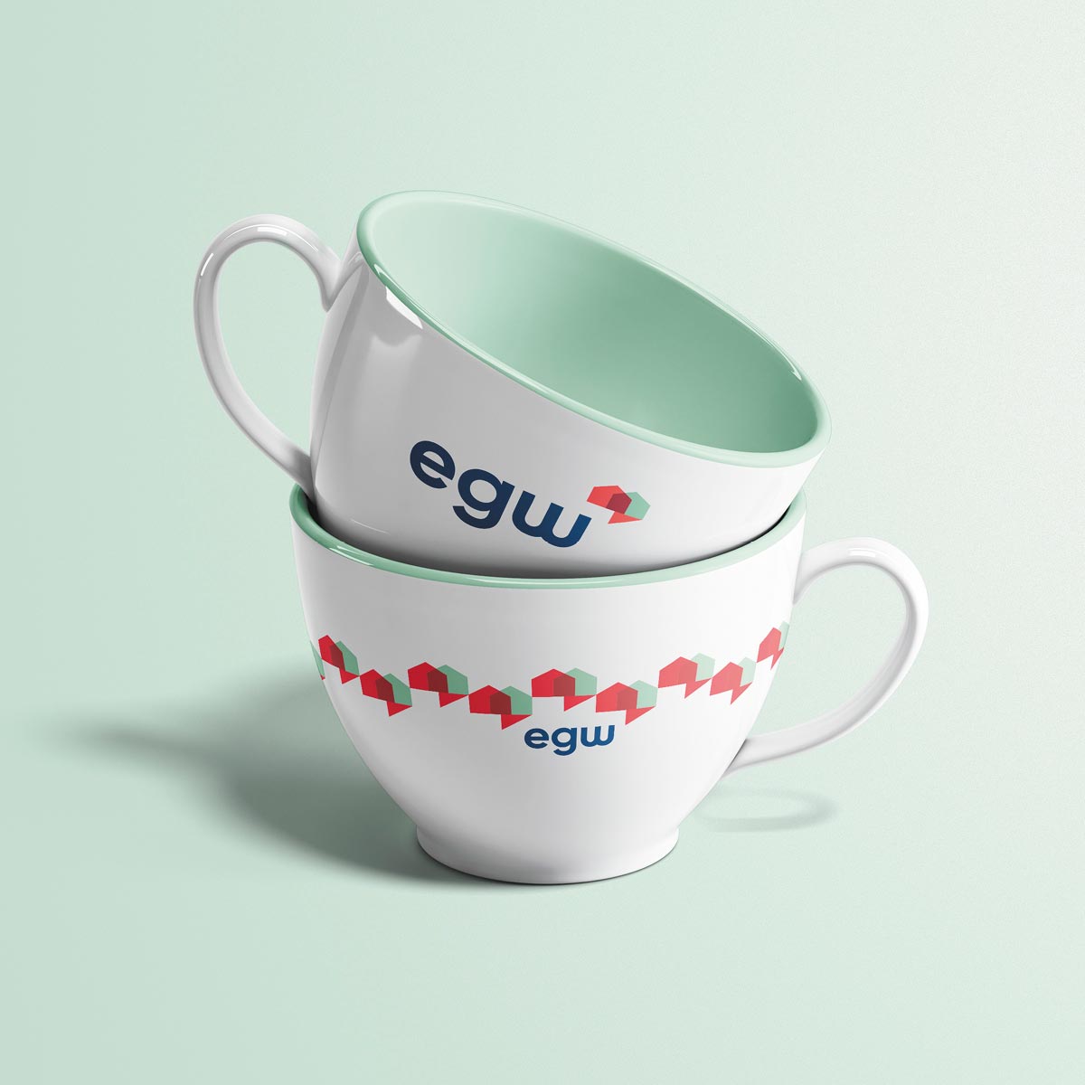
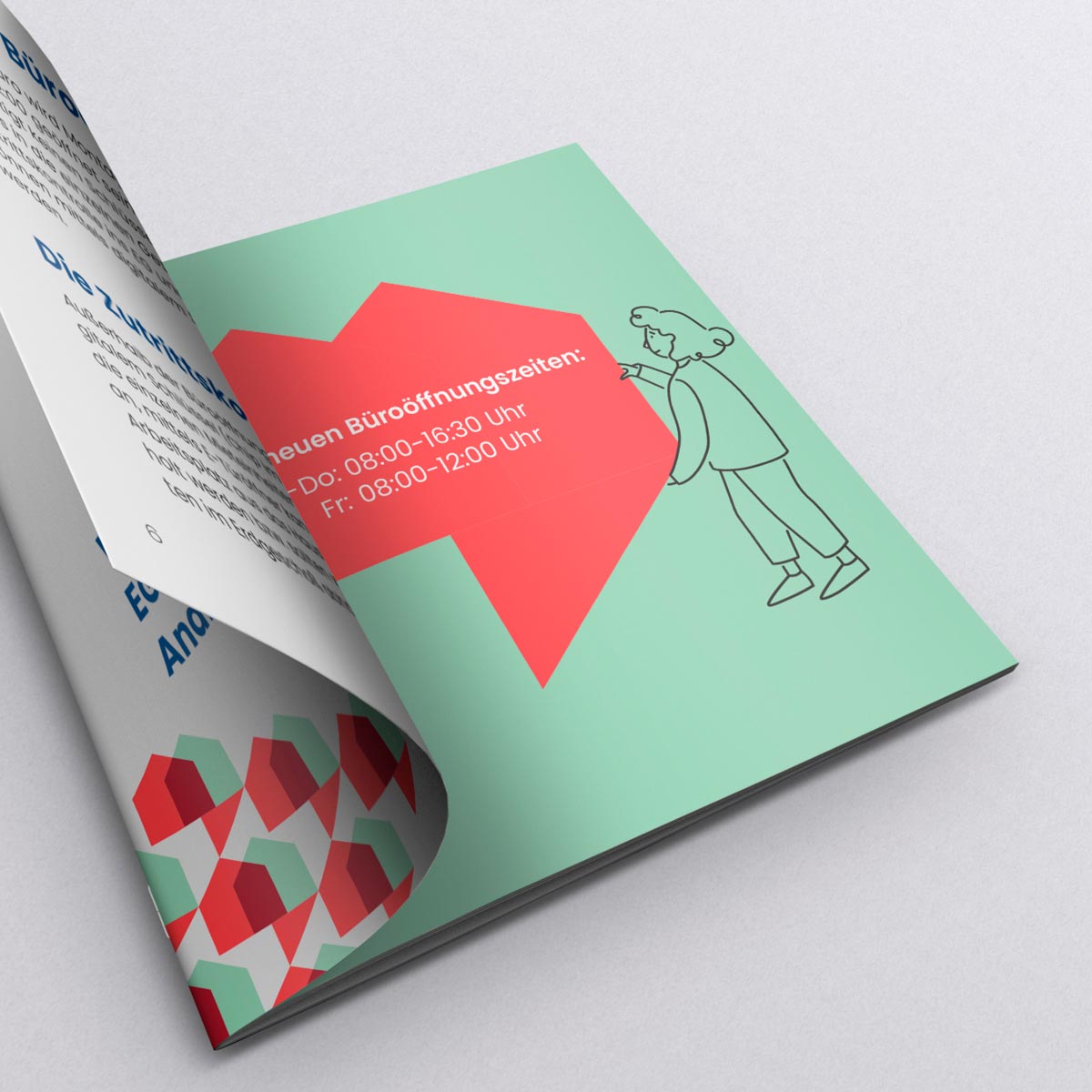
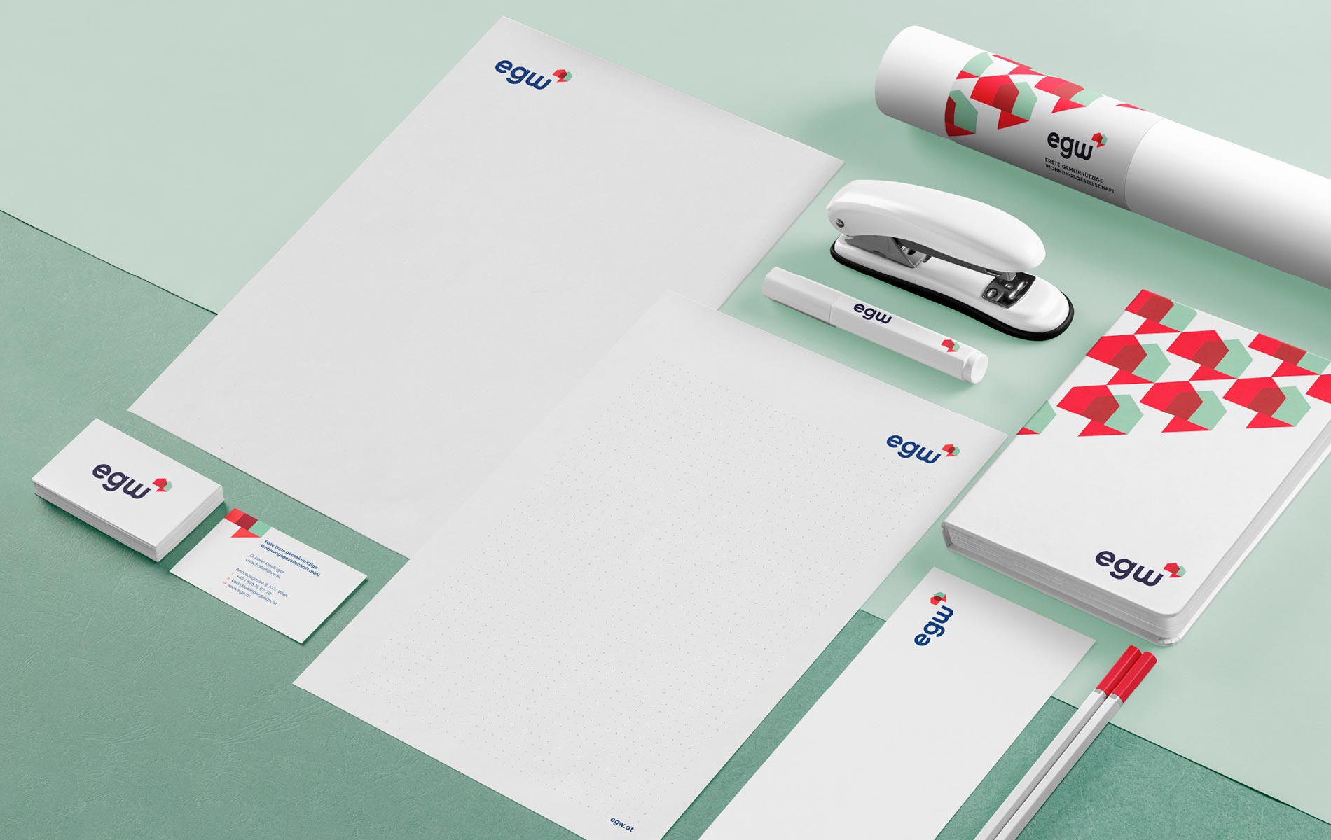
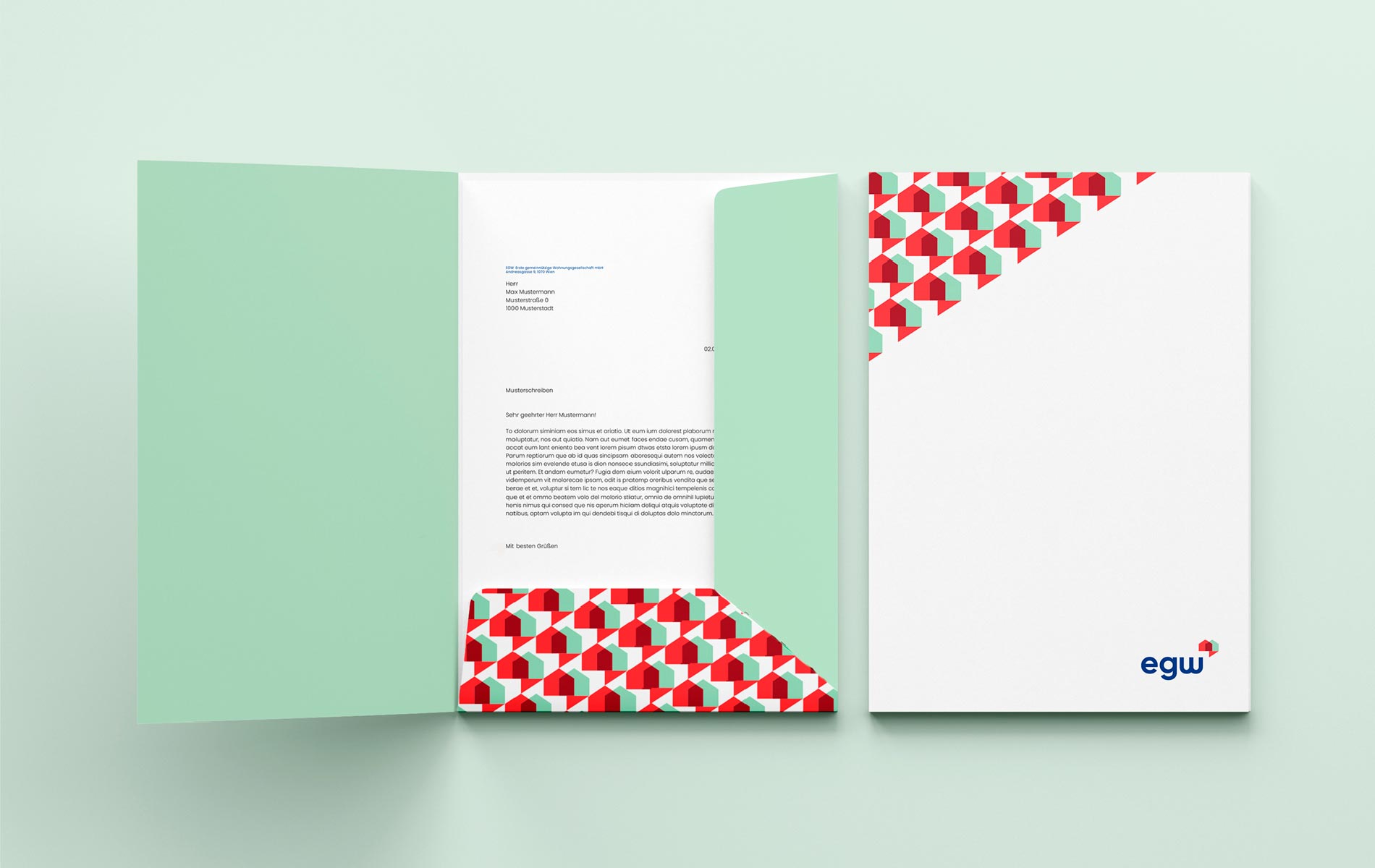
After a series of in-depth brand interviews and workshops with the top management at EGW we could create the perfect visual corporate identity for their needs. The cornerstone of the rebranding is the elegant handcrafted typeface supported by a strong brandmark full of meaning. The brandmark symbolises the merging of houses to form a dialog box which reflects the caring customer service and the key purpose of EGW, to supply a home to those who need it most.
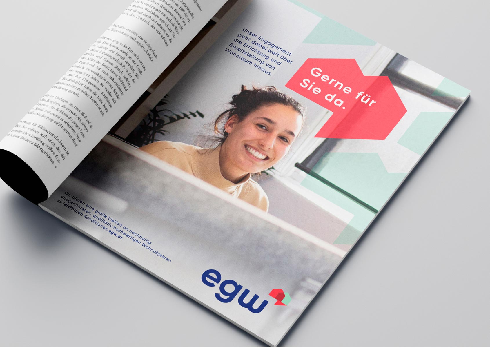
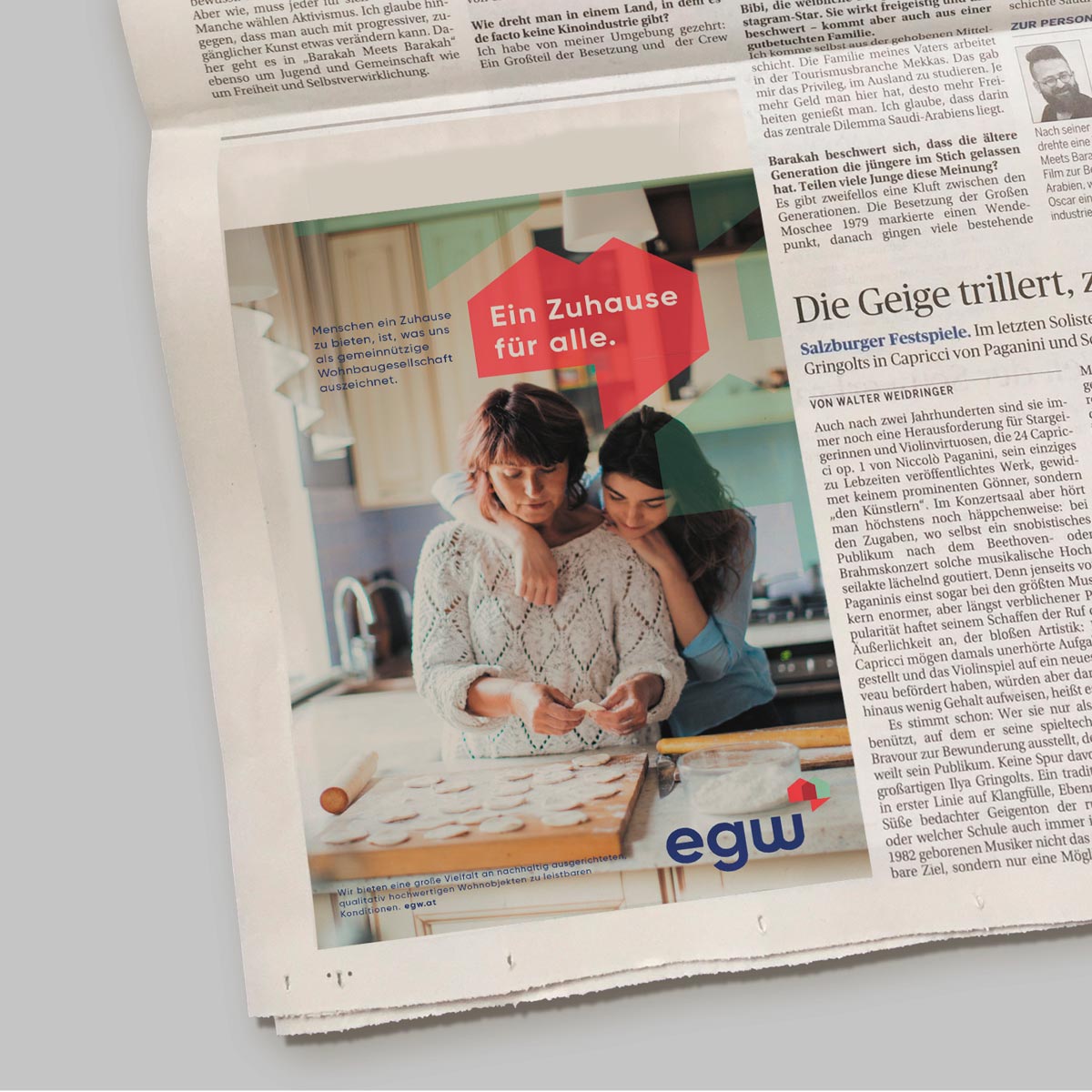
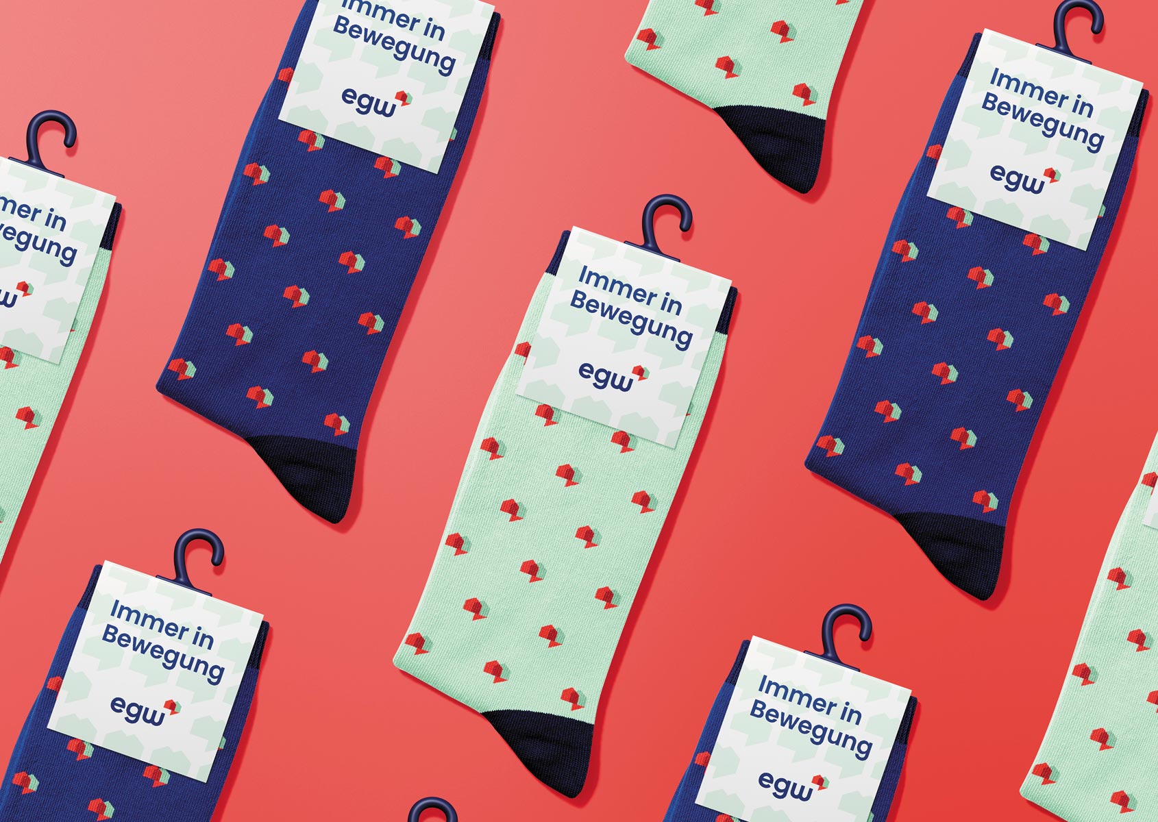
The brandmark contributes heavily to the design language and brings consistency, a high recognition value and a decorative element to all possible materials. The new brand launched with a teaser to partners and employees, rather than a simple letter we created a mailing and giveaway people can identify with from head to toe.